 Contact Us Now
1. What is the Cumulative Layout Shift Index?
Cumulative Layout Shift is an indicator that measures the degree of unexpected movement of elements on a web page. The types of elements that tend to cause change are fonts, images, videos, contact forms, buttons, and other types of content.
CLS is intended to gauge visual stability, assessing how often users encounter unexpected layout changes. And, of course, these unexpected changes in the display are unwanted because pages that change a lot cause a poor user experience.
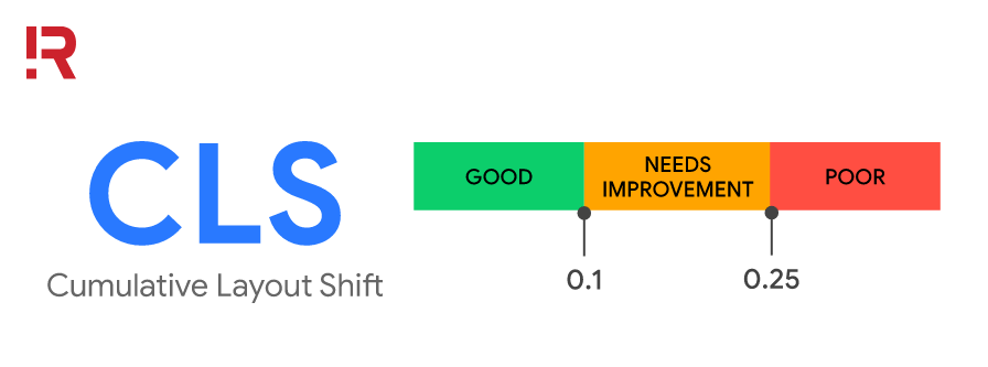
The ideal Cumulative layout shift is 0.1 seconds or less
CLS is best at 0.1 seconds or less, 0.1 to 0.25 seconds needs improvement (temporary acceptance). Any score greater than 0.25 seconds is classed as a bad index that must be improved immediately to avoid confusion when users operate, as in the example above.
2. Why does Cumulative Layout Shift happen?
According to Google, there are 5 reasons why Cumulative Layout Shift occurs:
- Image has no dimensions.
- Ads, embeds, and iframes have no dimensions.
- Dynamic content.
- Web fonts cause FOIT/FOUT.
- Website speed.
- Animation.
3. Treatments that improve CLS scores
3.1 Image has no dimensions
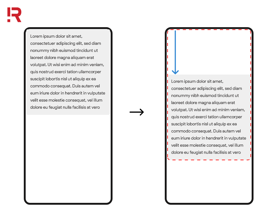
Always include width and height dimension attributes on your images and video elements. Also, reserve the necessary space using CSS aspect ratio boxes. This approach ensures that the browser can properly allocate space in the document while the image is loading.
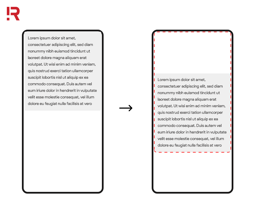
Layout change occurs when the image does not have the specified size
First when the HTML is downloaded, then the image is downloaded: When the image size is not specified, it causes the main content to jump to the bottom of the page.
If you provide width and height attributes in the <img> image markup, even if the browser only has HTML, it can still allocate the appropriate amount of space.
No layout change occurs when the image has the specified size
Rendering will happen (as shown in the above graphic) when the appropriate amount of space is made available for the image and there will be no change in the layout of the text when the image is downloaded.
3.2 Dimensionless ads, embeds and iFrames can cause Cumulative Layout Shift Advertisement
Advertising is one of the biggest causes of layout changes. To give advertisers more flexibility in their campaigns, publishers often support dynamic ad sizes. Once the ad content is displayed, the slots can also be resized if there is not enough space for the ad. All these dynamic changes push and pull content on the page. One way to deal with ads that cause low CLS is to style the element where the ad should show. For example, if you style to have a specific height and width then the ad will be restricted to those.
There are two solutions if there is a shortage of inventory and the ads are not showing:
If the element containing the ad doesn't show the ad, you can set the element to have an alternative banner ad or a placeholder image used to fill the space.
Also, for some layouts where the ad fills the entire row on top of perhaps a column on the right or left side of the web page, if the page is not visible there will be no change. They won't make a difference on mobile or desktop, but that depends on the theme layout. You will have to check if inventory is the problem.
Limit placing ads near the top of the view. Ads near the top of the viewport can cause larger layout changes than those in the middle. This is because ads at the top often have more content at the bottom, meaning more elements move as the ad causes a shift. In contrast, an ad near the middle of the viewport may not move as much of the content above it.
Embedding and iFrame
Embed codes allow web content to be displayed from elsewhere on your site. For example, videos from YouTube, Google Maps, Instagram posts, etc. However, the problem is that most widgets don't pre-include the exact size of the embedded content.
The problem, however, is that most add-ons often don't know in advance how large an embed will contain an image, video, or multiple rows of text. As a result, platforms that provide embeds don't always reserve enough space for them which can cause layout changes when they finally load.

The embed code allows web content to be displayed from elsewhere on the page
To get around this, you can minimize the CLS by computing enough space to embed with placeholders or fallbacks. A process you can use for embedding:
- Get the height of the final embedding by checking it with the browser developer tools.
- Style a placeholder to embed in these dimensions.
- You can also use media queries to explain any difference in ad/placeholder sizes between different form factors.
- After the embedded content loads, the iframe it contains will resize to fit its content.
3.3 Dynamic content
Avoid inserting new content on top of existing content, unless it’s to satisfy user interaction. This ensures any layout changes that occur are expected. You've probably experienced a UI layout change when elements unexpectedly pop up at the top or bottom of the viewport on a web page. Similar to ads, dynamic content comes in many varieties such as banners and signup forms, or notification bars that change the rest of the page's content, such as:
- "Related” content
- "Install our [iOS/Android] App"
- “Register for reservation”
- “Order here”
If you need to display dynamic content on top of existing content, predefine the space for that dynamic content (e.g. using placeholders or the skeleton UI) so that when loading, it does not cause the content in the page to change unexpectedly.
3.4 Web fonts cause FOIT/ FOUT
Nearly every website these days uses at least one custom font (fonts from Google Fonts or other sources). Since those fonts are spaced and sized differently from the default browser fonts, when the custom font is done loading it will cause layout changes throughout the site.
Font loading and rendering can cause layout changes in two ways:
- During the download process, the text will display in the browser's default font and when the download is complete, it will change back to a custom font causing FOUT - Flash Of Unstyled Text.
- The text is hidden until the custom font is loaded, causing FOIT - Flash Of Invisible Text.
Tools that can help you reduce this:
- Font-display allows you to modify the rendering behavior of custom fonts with values such as “auto”, “swap”, “block”, “fallback”, and optional. Unfortunately, all of these values (except optional) can cause re-representation.
- Font loading API can reduce the required font fetching time.
For Chrome 83, the following can be suggested:
- Use <link rel=preload> on major web fonts: preloaded fonts have a higher chance of getting the first coat of paint, in this case, no layout change.
- Combine <link rel=preload> and font-display: optional.
3.5 Site speed
Changing the layout in response to user interaction is a positive step. However, your site must load what it needs to load within 0.5 seconds (500 milliseconds) of the last user interaction in order not to count towards Cumulative Layout Shift score. So optimizing your site for speed and responsiveness is really important to your site's CLS score.
3.6 Motion effects animations
Animations can certainly enhance the user experience only if you integrate them correctly into the website. If a motion effect causes a change in dimensions such as the width and height of an element, it will result in a change in position, resulting in a CLS problem.
Instead of transforming the height and width dimension properties of an element, use transform: scale(). To shift an element, avoid changing the top, right, bottom, left properties, and instead use transform: translate(). Make sure the motion effects last less than 500ms.
You should use linear animation, which has a constant speed instead of "ease", which increases the speed at the beginning, slows down at the end, and has a longer duration. To learn more about which CSS properties change web page layout, see also CSS Triggers and High-performance animations.
4. Cumulative Layout Shift can sneak in during web development
Cumulative Layout Shift may be adopted during development. What can happen is that much of the content needed to render the page is loaded into the browser's cache.
The next time a developer or publisher visits a page under construction, they won't notice the layout change because the page elements have already been downloaded. That's why it's so useful to measure during testing or live.
5. How to calculate Cumulative Layout Shift
The calculation involves two metrics/events - the impact fraction and the distance fraction.
5.1 Impact fraction
The impact fraction is a measurement of the amount of space an unstable element takes up in the viewport. The viewport is what you see on the mobile screen. When an element loads and then changes, the total space the element has taken up, from the position the element took up in the viewport when it was first rendered to the last position when the page was rendered.
The impact fraction is the amount of space an unstable element takes up in the viewport
In the image above, there is an element that takes up 50% of the device's viewport. Then in the next frame, the element moves down 25% of the viewport height. The red hyphenated rectangle indicates the combination of the element's visible area in both frames, which in this case is 75% of the total viewport, so its impact fraction is expressed in points 0.75.
5.2 Distance fraction
The second measurement is called distance fraction. The distance fraction is the maximum distance the unstable element has moved from its initial position to its final position (horizontally or vertically) divided by the maximum viewport size (width or height), whichever is greater).
Distance fractions
In the above example, the viewport's largest dimension is the height, and the unstable element has moved 25% of the viewport's height, that is, a distance fraction of 0.25. The CLS cumulative layout score is calculated by multiplying the impact fraction by the distance fraction. In this example, the impact fraction is 0.75 and the distance fraction is 0.25, so the layout shift point is 0.75 x 0.25 = 0.1875.
There are several other math operations and other considerations when going into the calculation. The important takeaway is this: scores are a way to measure an important user experience factor.
6. How to measure Cumulative Layout Shift
There are two ways to measure CLS, according to Google: the first is called Lab Data (in the lab), the second is called Field (in the field).
Note: Lab tools typically load pages in a synthetic environment and therefore can only measure layout changes that occur during page load. Therefore, the CLS values reported by laboratory tools for a given page may be less than what real users experience in the real world.
Lab tools include:
- Chrome DevTools
- Lighthouse
- WebPageTest
Field tools include:
- Chrome User Experience Report
- PageSpeed Insights
- Search Console (Core Web Vitals report)
- Web-vitals JavaScript library
7. Conclusion
By eliminating or reducing layout changes, you improve the user experience of your site which can lead to an increase in conversion rates. Optimizing the Cumulative Layout Shift point always brings significant benefits. It is also important because the CLS index is also one of Google’s ranking factors since 2021.
So is the CLS index on your website any good? Analyze your website for free with R Digital.
>>> See more: Impact of Core Web Vitals in business
R Digital is a full-service global Digital Marketing agency that specializes in the development of Digital Experience Platforms. Whatever the size or reach of your business, we will develop a solution that fits.
For inquiries, questions, or appointments, don’t hesitate to contact us. Get personalized support and insight from top marketeers.